The decision, with conditions
- Choose this route when
- Choose each surface for its actual task, then compare the clay-colored tile or front with an independently selected worktop and clearly detailed junctions.
- Use the alternative when
- Concentrate the earthy color in a suitable wall or dry surface when the visually preferred material does not suit frequent water, preparation, or its required care.
- Stop or change the plan when
- Stop ordering when intended application, product construction, substrate preparation, or maintenance remains unclear; a coherent palette is not a completed working specification.
Compare the practical options
| Surface choice | Product question | Design decision |
|---|---|---|
| Clay-colored wall tile | What exact application and care are specified? | Use a product appropriate to the proposed backsplash |
| Main preparation worktop | How does it handle the household's actual tasks? | Choose performance independently before comparing color |
| Tile-to-counter edge | How is the joint finished and renewed? | Draw an intentional maintainable junction |
| Timber accent | Does its finish suit the location? | Concentrate warmth in an appropriate dry area |
Earthy color does not require one material everywhere
Terracotta color can bring warmth to a Mediterranean-inspired kitchen through tile, painted fronts, or a modest ceramic accent. The visual association is useful, but it should not decide every working surface. A wall tile, a floor tile, and a worktop face different conditions. Their color relationship can be shared while their construction and performance remain deliberately different.
Decide where warmth is visually needed and where performance is most demanding. A clay-colored backsplash can supply the atmosphere while another specified surface handles preparation and washing.
Map the tasks before the palette
Draw the sink, drainer, main preparation area, cooking surface, and landing zones. Note where water remains, where food is chopped, and where warm cookware may be placed. These observations should guide product questions. A surface beside occasional coffee making has a different routine from the counter used for intensive daily cooking.
Also record the cleaning habits the household can sustain. Some owners accept periodic treatments or visible change; others want a simpler wipe-down routine. Neither preference should be discovered after installation. If a material's care requirements conflict with the actual cooking schedule, use its color or texture in a less exposed location and choose another specified product for the main task area.
Ask what the tile actually is
Ask whether terracotta names the color or the actual tile construction. Record the exact range, finish, intended application, treatment, cleaning, and installation requirements before comparing its price.
Request the technical and care information for the exact range and finish. A decorative wall tile may not be appropriate for a floor or a work surface. The installer should coordinate substrate, adhesive, joints, edges, and any required treatment. Color selection is only one part of the specification, and a confident room depends on the less visible parts being equally clear.
Choose the worktop independently, then compare it
Select candidate worktops according to the actual tasks and product limitations. Consider water, heat, staining, scratching, cleaning, and repair, using supplier information rather than general promises about a material category. A surface should be judged by the household's use and its installed details, not only by the beauty of a sample.
Then place the worktop sample beside the clay-toned tile. A quieter top can let the tile carry the color, while a busier top may need a plainer surrounding wall. Avoid combining several strong patterns simply because each looks natural. The room's warmth can come from a few clear relationships rather than a dense mixture of earthy references.
Before accepting visible worktop change as patina, review Deciding whether kitchen patina is genuinely welcome.
Detail the junction between tile and counter
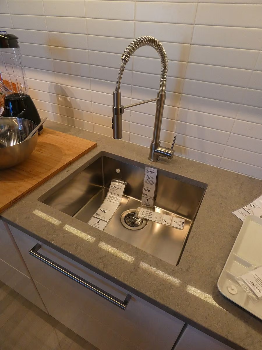
Draw the backsplash's lower edge, corner, end, and relationship to the window or cabinet. The transition should accommodate the chosen products and installation requirements. Ask the fabricator and tiler how the joint is made and maintained. A tiny line in a decorative drawing is still a real technical junction in the room.
Consider what happens if one tile is damaged or a seal needs renewal. Standard formats and retained spares can be useful, though availability and matching vary. A deliberate trim or finished edge may be more practical than trying to hide every termination. The best detail is one the owner can understand and maintain, not one that only looks seamless on installation day.
For a broader backsplash cleaning and personality decision, compare A Kitchen Backsplash with Personality and Sensible Cleaning.
Use timber where it adds touch and balance
Oak or another appropriate timber can soften the tile's color on dry cabinet fronts, a shelf, or an outer panel. Keep its finish and exposure suitable for the location. A rustic appearance does not remove the need for smooth edges and a practical cleaning method. The most frequently handled parts deserve close inspection.
If the kitchen already has a warm timber floor, reduce the number of additional wood tones. A painted cabinet may provide a calmer frame for the tile and worktop. Compare the whole palette in the room under daylight and task light. Warm colors can shift considerably when reflected from nearby surfaces, so small isolated samples are not enough.
Test the lighting against texture
A textured tile can become much more prominent under a light placed close to the wall. That may be attractive, but it can also exaggerate irregular joints or create distracting shadows on the working area. Test a representative sample under the intended light position before completing the installation.
The main requirement remains useful illumination on the preparation surface. A decorative pendant cannot replace a well-placed task source. Check reflected glare on the worktop from the standing cook's position and from nearby dining seats. Appropriate electrical work and accessible lighting components should be part of the plan, even when the visual aim is relaxed and handmade.
Compare care over time, not just installation cost
A less expensive tile may require additional treatment or more labor to fit. A costly worktop may still have limitations the household dislikes. Compare the complete installed scope, including preparation, cutouts, edges, sealing where relevant, and care. No current local price is assumed; the useful comparison is between clearly described alternatives.
Ask whether cleaning products used on one surface are suitable near another. A kitchen combines materials at close range, and care instructions should be understood together. Keep them in one record along with retained samples and spare tiles. The owner should not have to reconstruct the finish specification from a photograph years later.
Keep the warmth after the kitchen becomes busy
Before approving the final palette, imagine the room with food, utensils, and appliances in use. The tile should still provide a coherent background rather than compete with every object. A small amount of earthy color may be more lasting than covering every surface with the same strong tone. Restraint can make the material feel more intentional.
In a fictional evening, a warm wall color sits behind an ordinary meal being prepared on a dependable worktop. The kitchen feels relaxed because its different surfaces have clear jobs. Confirm the exposure map, exact tile specification, worktop limitations, junctions, timber finish, task lighting, and care. The visual warmth becomes convincing when cooking does not require protecting the room from its own design.
Check, record, then decide.
A proposed worksheet for your own observations. Use consistent units for dimensions and keep the conditions with each record.
Color versus product identity
Where to check With the exact proposed terracotta-colored tile, its packaging or specification, and the intended wall location.
- Record
- Record product range, finish, intended application, stated treatments, and care; distinguish clay color from a confirmed material construction.
- Read the result
- The color name cannot establish absorption, suitability for a floor or backsplash, or a product's resistance to kitchen exposure.
- If it does not work
- Compare another specified tile if the supplier cannot document the intended application and maintenance requirements.
Task-specific material split
Where to check Across sink, preparation, cooking, and dry serving positions on the kitchen drawing.
- Record
- Mark which actual tasks occur on each surface and list the relevant limitations of each candidate worktop beside that location.
- Read the result
- A shared earthy palette does not make tile, timber, and worktop interchangeable; a task map is not a performance test.
- If it does not work
- Keep clay color on a suitable wall or front and choose the main working surface independently when requirements conflict.
Counter-to-tile edge and light
Where to check At a representative corner or termination beneath the intended task-light position.
- Record
- Place large samples together, record joint and edge dimensions from the installer drawing in millimeters, and note glare or exaggerated texture.
- Read the result
- The sample shows visual coordination, not a watertight joint, suitable adhesive, or an adequately prepared substrate.
- If it does not work
- Simplify the profile, adjust the light, or request a clearer fabricated junction before the materials are ordered.
A practical trial
- Ask which spare tiles or matching edge pieces should be retained.
- Read cleaning instructions for adjoining materials together to identify conflicts.
- Compare the full installed scope instead of a tile price per box alone.
Compare the same scope
- Exact tile application, preparation, and treatment
- Worktop fabrication, cutouts, and practical limitations
- Edges, joints, lighting, spares, and care
Cost drivers to discuss: Substrate correction and detailed terminations; Worktop cutouts and fabricated edge forms; Additional sealing or specialist installation specified.
Choose another route when: A color-led product choice is unsuitable when its exact application or care conflicts with the kitchen task, regardless of how coherent the sample palette appears.
The download is a blank record template. Your completed notes remain wherever you choose to keep them; this page has no measurement-submission service.
Sources for this guide
Each reference’s supported point and limits appear beside the relevant passage above. Product documentation applies to the named product, rather than every similar item or the photographed room.
- Natural Stone Institute: Care and Cleaning of Natural Stone · Read the supported point and its limits
Source text checked November 4, 2026. Specifications can change; confirm the current instructions for the exact item before ordering.
Your questions, considered.
Does terracotta color tell me how a kitchen tile performs?
No. It can describe appearance rather than construction. Obtain the exact tile's intended application, finish, installation, and care information.
Must the worktop match the terracotta backsplash?
No. Select the worktop for actual preparation, water, heat, cleaning, and repair needs, then compare its visual relationship with the tile in the room.
What should a tile-and-worktop quote include?
Compare preparation, cutouts, edges, installation, joints, sealing where relevant, and care. A panel or tile price alone does not describe the finished working zone.
About this guide: written with AI assistance for TIANLICHUJU. These are general design ideas, not a measured survey or a completed client project. Any domestic vignette is fictional. Confirm product specifications, site dimensions and local requirements before construction; use qualified professionals for regulated work. Read our editorial approach or suggest a correction.