The decision, with conditions
- Choose this route when
- Choose the pink when the actual sample works beside the finishes that will remain and under the daylight and electric light used in the room, with the final coating specified separately.
- Use the alternative when
- Use pink on a more changeable element when its relationship with a fixed floor or large existing finish remains unsatisfying after a reasonable comparison of candidates.
- Stop or change the plan when
- Do not order the whole-room coating from a screen image, an isolated chip or a descriptive name; resolve the actual color relationship and required product finish before committing.
Compare the practical options
| Sample observation | What to compare | Decision to make |
|---|---|---|
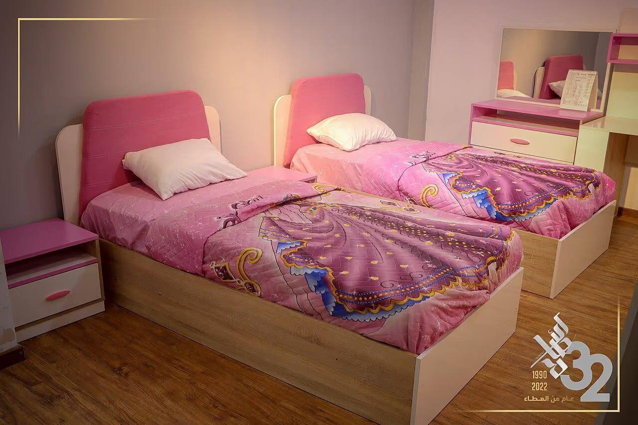
| Pink looks peachier near the floor | The real timber or flooring sample | Whether that warmer relationship is wanted |
| The shade changes under lamps | Normal evening light, not only midday | Whether paint or lighting should change |
| The wall colour works but edges feel harsh | The trim and adjoining surface | The contrast the architecture needs |
| The colour is right but marks worry you | Exact paint technical and care information | A suitable product and sheen for the exposure |
A name is not a colour specification
Treat blush, rose and dusty pink as starting labels, then compare actual candidates where the color will be used. Identify the floor, trim and large furnishings that will remain. A candidate succeeds through its relationship with those elements, not through an appealing name or a photograph from another room. Keep the chosen color separate from the later decision about the exact coating, finish and preparation.
Build a comparison board from what is real
Build the comparison around the least changeable finish rather than the newest accessory. Place two or three candidates beside that finish and use a consistent reference so their differences remain visible. Record which relationship fails and why before adding further options. If the problem belongs to one fixed edge, revise that junction or the color's proposed area rather than endlessly replacing small decorative samples.
If walnut is the fixed finish, use the more specific comparison in A Pink and Walnut Interior That Feels Precise.
Test the wall as a surface, not a postcard
Use sufficiently large movable sample boards to see a colour field rather than a dot. Follow the sample product's preparation and coating instructions, and remember that a test pot may not reproduce the final paint's sheen exactly. Hold the board vertically, where the wall colour will actually appear. A board lying flat on a table catches light differently and can give a misleading impression. Move it between the window side, the shaded corner and the area beside the most important fixed finish. Look from the normal seated position as well as close up. Avoid painting many narrow swatches immediately next to one another and trying to judge each in isolation; the neighbouring colours can alter the comparison. Leave a margin of a consistent background around each sample where practical.
Follow the room through its own light
Make observations at the times you use the room. Morning daylight, a cloudy afternoon and the existing evening lamps can produce different impressions. A room used mainly after work should not be chosen solely from a sunny lunchtime visit. Test the proposed lamps too if they will change as part of the project. Their light output, distribution and colour rendering all affect the appearance of surfaces; a label describing the light as warm does not guarantee identical results between products. Write short notes such as peachier near the oak floor or duller under the current shade. Specific observations are more useful than repeatedly asking whether the sample feels right. If the colour becomes unpleasant under one frequently used lighting condition, first decide whether the lighting or the paint is the thing you genuinely want to change.
For a room with limited direct light, consider Making a North-Facing Room Feel Deliberate.
Choose the contrast, not only the pink
A pink wall is read together with its edges. Bright white trim can sharpen the colour boundary; a related soft neutral can make the transition quieter. Dark timber, black metal and deep green fabric each introduce a different relationship. Test these combinations rather than assuming a popular pairing will work with your existing materials. In a small room, painting adjoining surfaces in closely related tones may reduce visual interruptions, but it will not increase the physical space or solve a poor layout. If architectural details are important, stronger contrast can help them remain readable. Decide what should be noticed first: the room's proportions, a particular piece of furniture or the coloured wall itself. The answer will guide how much contrast the surrounding materials need.
Sheen and colour are separate decisions
Two paints with similar colour can look different because their surface finishes handle light differently. A more reflective finish may emphasise changes in wall texture or produce visible highlights. A flatter appearance can be visually soft, yet cleanability and durability are product-specific rather than something guaranteed by the finish name. Read the technical information for the exact paint, including suitable substrates, preparation, drying conditions and care. For kitchens and other demanding areas, select a product appropriate to the exposure rather than choosing solely by colour availability. Ask how touching up is expected to work; a small repair may remain visible depending on product, age and lighting. A beautiful sample becomes a good decision only when its maintenance requirements suit the household.
When a pink room is the wrong starting point
If the room already contains several strong competing finishes, introducing a large pink area may create another problem to solve. First remove temporary visual noise and decide which permanent element should lead. A rented home with restrictions on repainting may be better served by a removable fabric, rug or artwork, subject to the relevant care and fixing requirements. Someone who changes colour preferences frequently may enjoy a smaller commitment rather than full-room paint. Equally, do not choose a weak pink merely because a stronger one feels daring. A tentative shade can still dominate a room while failing to give the atmosphere you wanted. Compare the actual options with a neutral baseline and allow the possibility that the best result is keeping the walls neutral and using pink elsewhere.
Make the decision easy to reproduce
Once a candidate survives the tests, record the exact product, colour code, finish, proposed coverage and preparation requirements. Check the supplier's instructions for calculating quantity rather than using a universal estimate; wall condition, product and application affect coverage. Keep a labelled sample and the purchase details for later reference. Before full application, confirm the final product on a discreet representative area where appropriate. Review the completed room after it is furnished, because a bare painted space may feel very different from one containing curtains, timber and fabric. The professional value of the process is not a promise that everybody will perceive the pink identically. It is that your choice can be explained, specified and checked against the real conditions of the home.
Check, record, then decide.
A proposed worksheet for your own observations. Use consistent units for dimensions and keep the conditions with each record.
Fixed-finish comparison
Where to check A vertical sample beside the actual floor, trim and largest retained fabric.
- Record
- Product and colour reference, comparison materials and relative impressions such as warmer, greyer or more peach-like.
- Read the result
- These are visual observations, not instrument readings or a universal undertone classification.
- If it does not work
- Compare a different candidate or keep the wall neutral if the fixed finishes conflict.
Lighting sequence
Where to check Window side, shaded corner and the position seen most often, at normal use times.
- Record
- Date, time, daylight conditions and exact evening lamps used for each sample observation.
- Read the result
- An appealing midday sample does not establish the evening result.
- If it does not work
- Decide whether paint or lighting is the intended variable before changing both.
Product finish
Where to check A representative prepared surface and the selected paint’s technical information.
- Record
- Sheen, substrate, coating instructions, care limits and what the supplier says about touching up.
- Read the result
- A colour match does not imply equal durability between products.
- If it does not work
- Choose a suitable specification or another location for pink rather than accepting unsuitable care.
A practical trial
- Label sample boards on the back so a colour name cannot be confused between products.
- View each board upright with a consistent surrounding margin, not flat on a table.
- Retain the approved reference, final product details and relevant preparation instructions.
Compare the same scope
- Same prepared substrate and area
- Exact paint product and sheen
- Preparation and application scope
- Coverage and care information supplied for that product
Cost drivers to discuss: Existing surface condition; Preparation and number of coats required; Product and application labour.
Choose another route when: Do not commission a full-room treatment before testing the retained finishes and the lighting conditions that matter to the occupants.
The download is a blank record template. Your completed notes remain wherever you choose to keep them; this page has no measurement-submission service.
Sources for this guide
Each reference’s supported point and limits appear beside the relevant passage above. Product documentation applies to the named product, rather than every similar item or the photographed room.
Source text checked November 4, 2026. Specifications can change; confirm the current instructions for the exact item before ordering.
Your questions, considered.
Can I choose a pink from my phone?
Use a screen to narrow the direction, then test the exact paint beside real materials. Screens, photographs and room lighting all change perceived colour.
Should a north-facing room always have warm pink paint?
No single orientation rule replaces observation. Test samples at the times you use the room and consider its actual daylight, finishes and lamps.
Does matte paint automatically clean better than other finishes?
No. Cleanability depends on the exact product and its technical instructions. Select the paint specification separately from the colour.
About this guide: written with AI assistance for TIANLICHUJU. These are general design ideas, not a measured survey or a completed client project. Any domestic vignette is fictional. Confirm product specifications, site dimensions and local requirements before construction; use qualified professionals for regulated work. Read our editorial approach or suggest a correction.