The decision, with conditions
- Choose this route when
- Choose a shared palette when both people can identify what they like in the actual samples and accept where each color appears at the proposed scale and permanence.
- Use the alternative when
- Use a quieter permanent background with changeable personal color when agreement is strong about room function but weak about committing a large shared surface to one preference.
- Stop or change the plan when
- Pause ordering when one person accepts the palette only on a small screen or under pressure; resolve the disputed relationship in the real room before making a difficult-to-reverse choice.
Compare the practical options
| Disagreement | Shared test | Possible resolution |
|---|---|---|
| Strong color versus quiet surroundings | Compare the amount and location of color | Keep a stable background with an expressive movable piece |
| Both dislike an averaged compromise | Separate hue from gloss, pattern and density | Combine preferences without mixing them into one shade |
| A single purchase dominates the scheme | Compare visual area, not item count | Make scale part of the shared decision |
| Color works only for one person at one time | View large samples together in ordinary light | Revise the specific undertone, surface or intensity |
Agree on the kind of room before negotiating the hue
Replace broad labels such as warm, bold or calm with an actual example each person can point to. Ask what makes it appealing: the color itself, its small area, its contrast or the daylight around it. These answers often reveal a shared room quality beneath different favorite colors. Agree on that quality and on the size of the next reversible test before assigning either preference to permanent surfaces.
The goal is not a mathematical average between two preferences. Mixing a vivid choice with a very pale choice may produce a compromise neither person likes. A more useful approach distributes color by scale, permanence, and location. One person may enjoy a strong chair while the other prefers quieter walls. Those preferences can coexist if the room's overall balance is considered. The agreement should feel like a shared design, not like one person's room with a small decorative concession to the other.
Make the disagreement specific
Each person should choose a small number of reference images and explain what they like in plain terms. The attraction may be the amount of daylight, the contrast between materials, or the uncluttered furniture rather than the color itself. Likewise, dislike may concern gloss, pattern, or density. Separate those variables. Someone who rejects a bright room image may still enjoy its hue in a matte textile. This discussion is more productive than labeling one taste bold and the other boring.
Identify firm constraints and flexible preferences. A person may be comfortable with strong color on a replaceable cover but not across every wall. Another may dislike a particular undertone but welcome several related hues. Keep the list short enough to guide decisions. If every preference becomes a rule, the process can produce an overly cautious room with no clear character. The aim is to understand the boundaries that genuinely matter and leave room for experimentation within them.
Assign color to surfaces with different commitments
Large fixed surfaces affect the whole room and are encountered continuously. Movable textiles, art, and smaller furniture can carry more change with less disruption. Decide where the shared background should be most stable and where individual expression can be stronger. This is not a hierarchy of whose taste matters more. It is a practical distinction between a wall that surrounds every activity and a chair or artwork that contributes to one part of the composition.
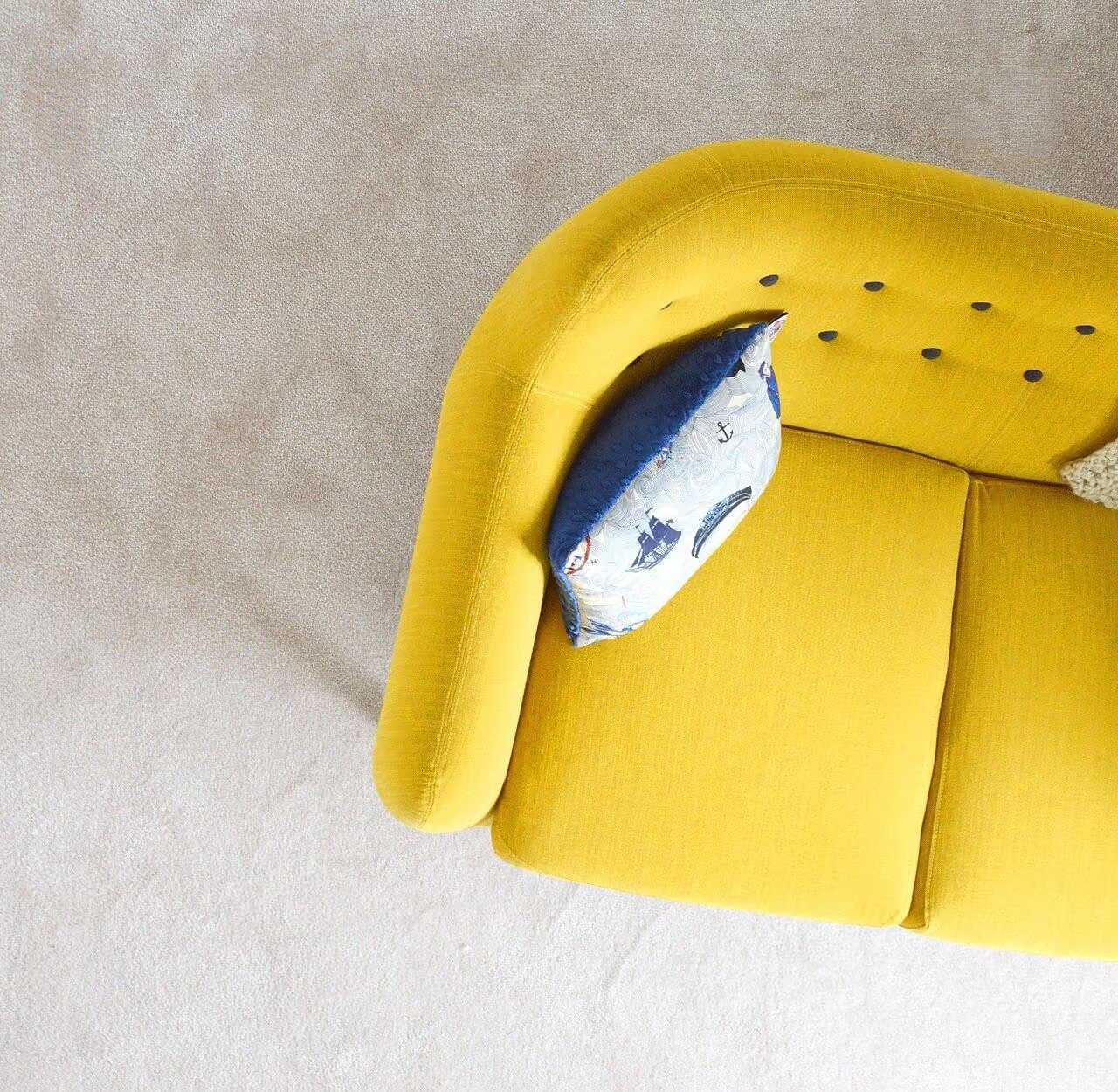
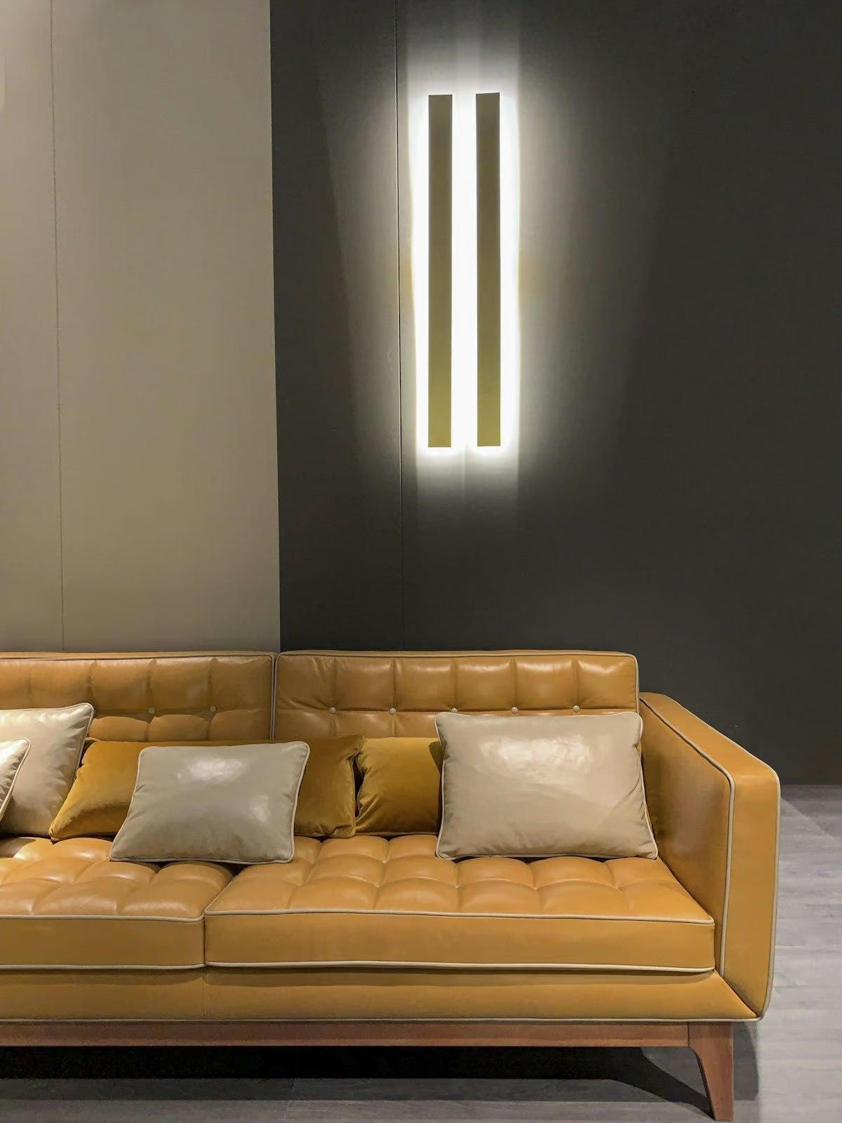
Consider the visual area, not only the number of objects. One brightly upholstered sofa may carry more color than several small accessories. A patterned rug can introduce a broad palette even when the walls remain restrained. Draw or photograph the major surfaces and compare their approximate presence. This helps avoid a misleading agreement in which one person chooses most items but the other person's single large purchase dominates the room. Shared decisions should account for scale as well as ownership of objects.
Test a palette together in the actual light
Agree in advance where and when the pair of candidates will be judged, then record reactions separately before discussing them. Include the fixed floor and furniture in the comparison. If disagreement concerns only one location or evening condition, change that part of the proposal rather than abandoning the entire palette. Do not let a sample test quietly become permission to order a larger or different finish.
Use a reversible trial for the strongest proposed color. A large textile or an appropriately prepared paint sample can show whether the hue feels welcome at room scale. Leave it in place long enough to encounter it during ordinary activities rather than only during a focused design discussion. Each person can note what works and what feels difficult. Compare those observations before changing several variables at once. The trial should provide evidence, not become a contest in which each person searches for reasons their original preference was correct.
Use relationships instead of dividing the room in half
A literal split between two palettes can make the room feel like adjacent territories. Look for a connecting tone or material that belongs to both sides of the discussion. A muted green might connect a vivid artwork with a warm neutral sofa; timber can bridge cool and warm colors without adding another painted surface. The connection need not be exact. Its job is to make the different elements read as one room while allowing enough difference for both people to recognize their preferences.
Personal objects can provide another bridge. A shared artwork, a piece chosen on a trip, or an inherited item both value can anchor the palette more meaningfully than a new set of coordinating accessories. Start from that object and let its colors inform a few other choices. Avoid requiring every possession to match. A room shared by two people should have enough visual structure to accept individual objects without turning each addition into a new negotiation over the entire scheme.
For the practical placement of that connecting color, read Making an eclectic living room coherent through one repeated color.
Keep the room's functions outside the color dispute
Furniture size, comfortable seating, useful light, and storage should be judged on their tasks. A favored color does not make an oversized chair fit, and a neutral finish does not make an inconvenient cabinet practical. Agree on those functional criteria first so they do not become indirect arguments about taste. If two pieces perform equally well, color and personal preference can then guide the choice. This separation reduces the chance that a practical concern is dismissed as a disguised aesthetic objection.
The same applies to maintenance. Discuss how the actual finish will be cleaned, repaired, or replaced. A pale fabric may require a level of care one person does not want to provide; a glossy dark front may show marks that bother the other. Those are legitimate daily considerations. Do not assign the burden of maintaining a shared choice silently to one occupant. A palette is more sustainable when both people understand its normal lived appearance and are comfortable with the routine it asks of them.
To agree on comfort separately from color preference, compare A Room for Quiet Conversation after a Busy Day.
Agree on a review point and then live in the room
Once the trial produces a workable scheme, record the main decisions and stop revisiting them continuously. Set a reasonable review point after the room has been used. Constantly presenting new images can make the agreement feel provisional and keep one person in a defensive position. The purpose of the process is to create a place to live, not an endless referendum on color. Allow the arrangement to develop associations through ordinary shared use.
At the review, discuss specific experiences rather than whether the room proves one taste superior. Perhaps the wall feels too intense in evening light, while the colored chair has become a favorite place to sit. Adjust the element that causes friction and preserve what works. A successful shared palette contains visible choices from both people and a clear relationship among them. Its value lies in that mutual recognition, supported by enough flexibility that the room can evolve without restarting the whole negotiation.
Check, record, then decide.
A proposed worksheet for your own observations. Use consistent units for dimensions and keep the conditions with each record.
Actual preference boundaries
Where to check In a joint review of a small set of references before selecting paint or furniture.
- Record
- Separate each person's desired room qualities from hue, gloss, pattern, density and firm dislikes.
- Read the result
- An apparent color disagreement may concern another surface quality or the amount of stimulation.
- If it does not work
- Test the flexible variable instead of averaging two disliked extremes.
Visual share of major choices
Where to check Across walls, sofa, rug and artwork represented at their intended room-scale areas.
- Record
- Sketch approximate color areas and identify which single large purchase would dominate despite item counts.
- Read the result
- Equal numbers of chosen objects do not establish balanced visual influence.
- If it does not work
- Redistribute stronger color by location, scale or replaceability.
Shared sample trial
Where to check Beside fixed finishes in the room's normal daylight and evening lighting, viewed by both occupants.
- Record
- Record sample codes and separate observations about what feels welcome or difficult at each time.
- Read the result
- Approval on separate screens is weaker evidence than shared physical samples under actual conditions.
- If it does not work
- Revise the specific tone or finish and repeat one controlled variable.
A practical trial
- Agree on the room's main activities before allowing color to determine furniture that does not fit them.
- Trial the strongest proposed hue reversibly and compare observations after ordinary use rather than debating only reference images.
- Record the accepted palette, expected care and a review point, then pause the search for competing schemes.
Compare the same scope
- Shared qualities and individual boundaries
- Color area and permanence
- Actual sample and lighting conditions
- Maintenance responsibility and review agreement
Cost drivers to discuss: Permanent versus movable color surfaces; Finish preparation or upholstery; Reversible textile and artwork changes.
Choose another route when: A compromise scheme is unsuitable when it silently assigns inconvenient maintenance to one person or leaves neither occupant comfortable with its dominant surfaces.
The download is a blank record template. Your completed notes remain wherever you choose to keep them; this page has no measurement-submission service.
Sources for this guide
Each reference’s supported point and limits appear beside the relevant passage above. Product documentation applies to the named product, rather than every similar item or the photographed room.
Source text checked November 4, 2026. Specifications can change; confirm the current instructions for the exact item before ordering.
Your questions, considered.
Should couples choose a color halfway between their favorites?
Not necessarily. Different intensities can coexist on different surfaces. A stable wall background and a strong movable piece may satisfy both better than an average shade.
How can we avoid splitting the room into two styles?
Find a connecting material, tone or shared object and distribute choices by scale and use. Avoid assigning literal territories that ignore the room's overall relationships.
How do we settle the palette without endless reconsideration?
Use a reversible shared trial, record specific observations and agree on a review point. After a workable choice, allow ordinary use rather than continuously introducing new reference images.
About this guide: written with AI assistance for TIANLICHUJU. These are general design ideas, not a measured survey or a completed client project. Any domestic vignette is fictional. Confirm product specifications, site dimensions and local requirements before construction; use qualified professionals for regulated work. Read our editorial approach or suggest a correction.